The only two UX rules you need to know

Is programming art, engineering or both? This is what I try to figure out, while striving towards user friendliness, simplicity and synergy. Philosophical when writing, precise when coding. DCI (Data, Context, Interaction) has been my major area of research for the last 10 years. Creator of Superforms for SvelteKit.
What is this, the bold statement of the year? Only two rules needed in UX, an area filled with so many "must-read" books, expensive design schools and huge project checklists?
Call me bold, but I'd say yes. You have common sense within you. You have experienced enough bad design to avoid disaster. And if you ever designed something bad, it was probably because you were stressed, or someone (your boss, a client, etc) made you do it.
"Sure, but still, only two rules?"
Yes. Maybe you've already read them. They can be found in one of the "must-read" books. But it's understandable if you missed them, there are plenty of other must-read books to read.
OK, bring them on!
All right, without further ado:
Make sure that: (1) the user can figure out what to do, and (2) the user can tell what is going on.
-- Don Norman, "The Design of Everyday Things"
There, you've read them; now take a minute to ponder about them.

That inner voice. Is it self-doubt, the endless marketing schemes, or silver bullet thinking that makes you reach for the latest advice, instead of simple, timeless advice?
"It's too simple," protests the inner voice from an unknown source. "Everything should be made as simple as possible, but not simpler." Now it's quoting Einstein and seems to gain a lot of confidence.
Before it convinces you, gently remind it that concrete advice and aphorisms are not on the same abstraction level, and one can hardly be used to dismiss the other.
Let's instead briefly look at the rules, one at a time, and see what insights we can gain.
1. Make sure that the user can figure out what to do
Here's a screen from a well-known application where everything is laid out before us.
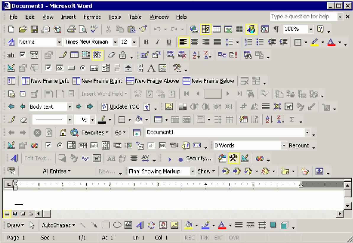
Isn't it great to have everything available at your fingertips? You only need to remember the function of all buttons and the layout, and you'll have no trouble doing exactly what you want. Right? No?
The inner voice seems to agree with us this time, it's overwhelming. So let us ask ourselves a key question: What is the conflict with rule #1?
Of course, there are so many things on the screen that it's hard to figure out what to do. That was simple.
User context and noun-verb operations
That was indeed simple, because the user context is very important. If the user wants to crop an image, she should be able to figure out what to do in that context.
This goes hand in hand with a great piece of advice from Jef Raskin: Prefer noun-verb construction instead of verb-noun.
In this case, cropping an image will then become image-crop, translating UX-wise to:
First, select an image
Then select the crop command and its parameters
Commit the operation.
For every step, we can now reveal additional information to the user, to make her figure out what to do next. Compare that to the opposite, crop-image:
First, select the crop command and its parameters (must always be visible)
Then select an image (not anything else!)
Commit the operation.
Let's also say that the user is interrupted between steps 1 and 2 and comes back later, forgetting that a crop operation is ongoing. She clicks on a text paragraph, and an obscenely loud windows error sound reverberates through the room, making her drop the freshly brewed cup of tea over the desktop and her new $300 noise-canceling earbuds.
Way to go, verb... but hey, at least the UX didn't break rule #2! 😄
So many things follow from revealing things to the user based on noun context.
...And by having clearly visible buttons/links/clickable areas for the most obvious actions to take at the time
And by pleasant typography
And a well-thought-out color scheme
And so on. You know this already.
Just ask yourself at every step of designing a user interface, can the user figure out what to do?
2. Make sure the user can tell what's going on
Interaction ahead! Now we're into real UX. Have you ever entered plenty of information into a website, clicked the submit button... and nothing happened. No wait, at the left bottom of the screen is our indicator of assurance:

Bless the browser for lightening the load of the designers, so they can hit the after-work early and look for the cute new girl at the office.
Isn't it ridiculous that the majority of websites can't at least provide feedback that their cheap hosting server is overloaded and will take up a bit of the user's precious time?
From now on we will respect the user more than that, right? But let's not break out the huge modal overlays already, let's see about the timing of notification first.
Response times
Jakob Nielsen has a useful piece of advice for us here, from Response Times: The 3 Important Limits:
0.1 second: The limit of feeling an instantaneous reaction from the system
1.0 second: The limit of feeling that the user is operating directly on the data
10 seconds: The limit of keeping the user's attention.
This means that if the server is lightning fast with a response time of around 0.1 seconds, we don't need to provide any feedback. That will just be a distraction.
After perhaps 0.2 seconds, we can provide feedback, maybe a loading spinner inside the button, and/or a "submitting" message next to it.
After 6-7 seconds instead of 10 (compensating for the internet attention span), we'll add an extra notice that something is taking more time than it should, but please be patient, dear user. We're thrilled that you're submitting your information to us.
Now apply this example to anything that goes on in your design.
The same goes for mistakes. If the user makes a mistake, make sure it's obvious that a mistake has been made, but it's not the end of the world.
Add helpful error messages next to the form field
Automatically scroll to the first error of a form, and place focus on the erroneous field
After nailing rule #1, let switching contexts happen without confusion
Etc!
Whenever the user does something, or if something takes time, make sure the user can tell what's going on.
We're at the end
This text is deliberately brief, because of what was said in the beginning:
You have common sense within you. You have experienced enough bad design to avoid disaster. And if you ever designed something bad, it was probably because you were stressed, or someone (your boss, a client, etc) made you do it.
This may get philosophical, but the message is deeper than what an article or a must-read book can convey. When we're not blinded by stress, ambition, competition or money, we can build on timeless principles instead of trends. We do that by connecting to ourselves and others, with empathy, respect and insights from deeper knowledge, distilled into pieces of advice that could be used as rules in the right circumstances. UX is a fundamental part of being human, our body, senses, perception and life itself, everything is there for us to use and understand.
You can do that, and by doing that you're making the world better even by coding a website, but I invite you to expand the concept to all areas of your life. So make sure that: (1) your fellow humans can figure out what to do, and (2) your fellow humans can tell what is going on.